For the first post on this here on my new website I have broken down the development of my new logo into major landmarks. You can follow the process in depth on the Spinquad forums. The logo may still evolve slightly but I have received good feedback on what I have so far.
 Old Logo
First I’m guessing most haven’t seen the old logo.
The old logo was nice, but it lacked a certain ‘moxy’ especially since it was only designed in 2D.
 Logo Drawing
In designing the new logo I wanted something I could use for all purposes, even for a movie opening. Designing for multiple uses means more detail than a simple outline, which is all the image to the above really is. However, I wanted to keep the logo simple so it could still work for design and print. I saw a door handle in Lower Manhattan made of bronze of a stylized lion head and decided try the idea with a polar bear. I love polar bears and honestly I have no idea why; but they do make for great logo material.
 Initial 3D Modeling
I started modeling before doing the 2D design because I’m more comfortable in 3D. Also, by starting in 3D I found placing emphasis on the right details easier.
 3D Icon
Adding a few incidence gradients helped sculpt the edges model and a weight map fills in the cracks with grime. The original door handle I used for reference was bronze, so I started to follow suit with a slightly tarnished silver but I decided to slap some paint over the ‘distinguished look.’ Suddenly a generic bear turned into a polar bear without too much effort and the whole logo on a life of it’s own.
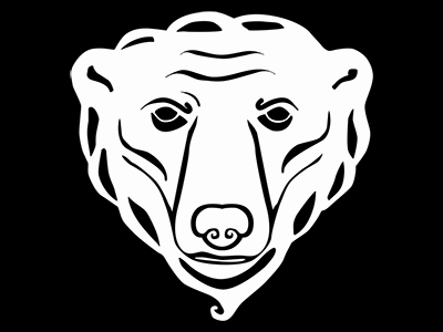
 2D Icon
After modeling I rendered the face and began tracing over it. Now that I had defined the shadows and strong features I knew where I wanted to take the 2D design. At this stage I went back and forth overlaying details from the 2D design to the model 3D and vice versa. In this way I refined the designs so each one reflects the other. The last two are the finished icons and you can see them used around the site.
Feel free to leave a message, critiques and comments are always welcome.
Leave a Reply